
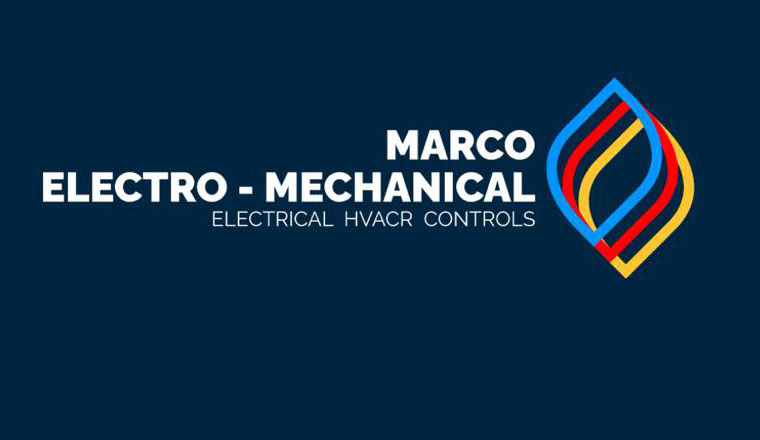
My brother-in-law started up his own business and was needing some help with the logo. This was the one they were able to make online, originally I was just going to turn it into a PNG file for them for better use, but I couldn't leave it the way it was.
Steps Taken
I didn't have a lot of time to work on this since their budget was very small, however, I wanted to arrange things to look a little more pleasing.
I started with the symbol because it looked a little flat and boring. I changed the positioning of the loop shapes to make it a little more pleasing to they eye, and then I added a gradient effect to each loop to give it a bit more definition and make it less flat.

The next step was to re-arrange the position of the words. It was very unbalanced and not very pleasing to look at. To fix this, I changed the sizes of the lines of text, added some letter spacing, as well as changed the weight of the font to make it easier to read and to help important things stand out, like the name.
Lastly, I felt like the logo had a lot of empty space beside Marco and I did not want to make it bigger since it would have thrown everything off balance. To fix this, I created a wavy symbol that matched the main symbol in colour to represent the air from heating and AC.
Final Results